When working in the Makeswift builder, two key terms are foundational to how you build and manage your site: Components and Elements. These terms are crucial for both technical and non-technical users alike, as they define how content, layouts, and the design system are structured and managed.
Let’s break it down.
What is a Component?
In Makeswift, a component is a set of elements that you can save and reuse throughout your site. Our components are either visually editable or are pre-made (see built-in components), located in the Component Tray within the Visual Builder. When you edit a component, you’re editing the individual elements inside it.
By default, components are global—meaning any change you make to a component will automatically reflect across the entire site, wherever that component is used. When you drop a component into a page, and it becomes an element, you can detach that instance if you don’t want to keep it in sync with the original component and everywhere that component has been placed on your site.
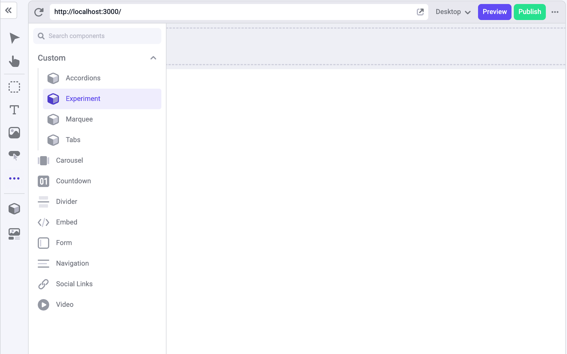
Built-in components
Built-in components are pre-made components that come with Makeswift or are built by a your dev team. These will live in your Component Tray, where you can drag and drop them into your pages. Built-in Components can’t be renamed or deleted. They’re ready-to-use in the builder, but you can’t change their core structure.
What is an Element?
An element is an instance of a component that is placed on the Makeswift canvas on your page.
Built-in elements
A built-in element is an instance of a built-in component that’s part of the page, as defined by the code. It can behave like any other element—editable based on what is made available by the user’s dev team—but you can’t move or delete it from the page. It has been placed there by the dev team and is essentially hardcoded into the page.
Why these terms matter
The key here is understanding that components can be created visually or with code. Both types can be used as elements in your pages.
- Components are the building blocks you’ll reuse across your site.
- Elements are the actual instances of those components in your pages.
- Built-in Components and Built-in Elements provide predefined, code-driven structure, giving you flexibility in content with well-defined guardrails.
For both non-technical teams and developers, understanding these distinctions ensures everyone knows what is editable, what is locked, and where things are coming from when working on the site.
By mastering these terms, you'll be able to work more efficiently in the builder and ensure your entire team—whether designers, marketers, or developers—stays on the same page.
For more information, view our docs.